Color palette / cottages · 6-minute read
A Swedish-Inspired Color Palette for Cozy Harbor Cottages
A cozy cottage scene can hold many colors without feeling crowded. The trick is to pick a few repeatable roles before you color the first roof shingle: a principal wall color, a supporting trim color, one accent, a nature color, and a quiet background. These are contemporary Swedish-inspired choices for coloring, not claims about the history of any particular folk-art tradition.
By Greatest Pages Press · Updated
A working color palette
These digital hex values are creative planning examples. Printed pencil and marker colors will vary.
#01295BUse for deep water, dark shutters, or a winter evening sky.
#B42E20Anchor a cottage facade or repeat sparingly in decorative hearts.
#24513DCarry it through garlands, pines, wreaths, or a front door.
#E3AF4DUse in small patches to suggest warm interior light.
#DFEAF2Keep snow shadows pale to preserve paper highlights.
#F5F2E5A planning reference for softer whites and calm negative space.
Give each color a job
Choose one color for the main cottage and one for its trim. If the siding is red, make most of the surroundings quiet: cream or pale blue snow, navy water and dark green trees. A small gold lantern can then draw the eye without competing with the front door.
Repeat each accent in two or three small places. A red window box can echo red berries; a gold star can echo a warm window. Repetition makes a busy drawing read as one scene.
Balance warm details with cool scenery
Try a warm-versus-cool plan: red cottages and amber windows against blue water and muted gray-blue snow. Keep the warm colors closest to the inviting focal point, then let the cool colors create breathing room across the background.
With colored pencils, layer a light blue shadow beside roof edges before adding a slightly darker blue under the eaves. With markers, test your chosen shade and paper separately before starting the book; different tools and paper behave differently.
A simple three-pass routine
Make the first pass on large shapes, a second pass on repeating ornaments, and a third pass on selective shadows. You do not need to fill every white area. The untouched paper can be the brightest part of a snowy page.
- Mark your three largest areas: sky, main building, and foreground.
- Color one small repeated motif in each area using the same accent family.
- Add your darkest value under rooflines, behind trees, and within windows, then stop and assess balance.
One last thought
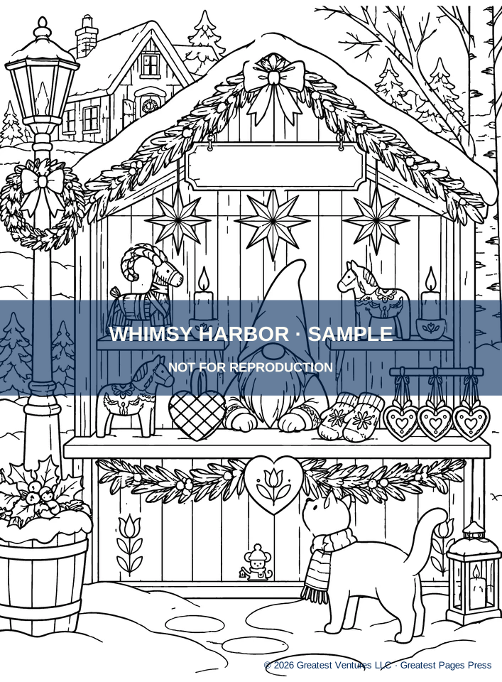
Use the color roles rather than copying the exact hex codes. The aim is a scene that feels consistent and personal, not a paint-by-number match to the Whimsy Harbor cover.