Technique / winter scenes · 7-minute read
How to Color a Winter Harbor Scene: Snow, Water & Lantern Light
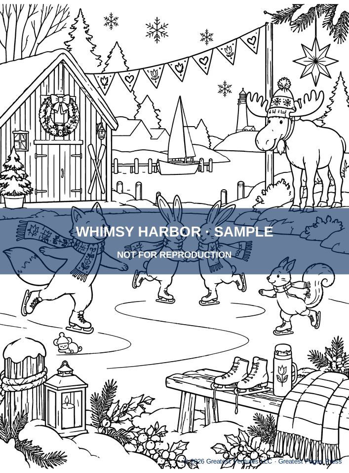
A winter harbor brings together several interesting surfaces on one page: bright snow, moving water, weathered wood and warm lanterns. Before choosing colors, decide where the light comes from. A lantern by a dock, a cottage window and the last evening light on the lake can each suggest different values without requiring photorealistic shading.
By Greatest Pages Press · Updated
Start with the biggest values
Look over the illustration and identify what should remain brightest: the tops of snowy roofs, the nearest snowbank, perhaps the reflection of a lantern. Leave these regions untouched at first. Choose a dark family for the distant trees and dock gaps, and a middle family for water and building walls.
A value sketch on scrap paper—three boxes labeled light, medium and dark—can help prevent overworking the entire page at the same intensity.
Color snow without making it gray
Snow often reads as white because its shaded edges supply context. Place a pale blue or cool lavender pencil along one side of a snowdrift, beneath an overhang or in the crease between mounds. Blend softly toward uncolored paper.
Keep the upper face of snowdrifts lighter than the sides. If your page is already visually detailed, avoid filling each white shape with a uniform blue wash; a few selective shadows create a clearer result.
Make still water and reflected light believable
Work with horizontal strokes for harbor water rather than painting everything in vertical strips. Preserve a little white between bands near the horizon, especially in line-art areas that suggest reflection or ripples.
Around a warm window or lantern, repeat a small amount of the same yellow or amber in short horizontal reflections. Let those strokes break up as they move toward the viewer. Keep distant water slightly quieter than the foreground.
Give docks and windows their own texture
For wooden docks, alternate neighboring planks between two related brown values, then add darker color near seams. Let the ink outlines do some of the texture work so the scene does not become muddy.
For windows, try a gold center and a warmer orange near one edge of a pane. If you use markers, test them on spare paper first and place a protective sheet behind the page as appropriate to your tools; no claim about this book’s marker performance is established.
A practical finishing sequence
Finish large backgrounds first and small ornaments last. The result does not need to mimic the printed cover: the black-and-white interior is an invitation to create your own evening, morning or midday harbor.
- Reserve the brightest snow, light sources and ripples.
- Establish three value groups across trees, cottages and water.
- Shade the undersides of snowdrifts and rooflines sparingly.
- Add warm light to windows and short reflections on the lake.
- Finish with a few repeated accents on scarves, stars or berries.
One last thought
A satisfying winter page usually depends more on contrast and restraint than on the number of colors you use. When the focal point reads at a glance, the scene is ready.