Patterns / decorative motifs · 5-minute read
Choosing Colors for Folk-Inspired Hearts, Tulips & Stars
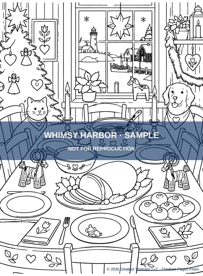
Whimsy Harbor interiors often pair large, recognizable scenes with smaller decorative details: hearts on linens, tulip-like flowers, hanging stars and repeating shapes. These motifs are inspired by Nordic decorative sensibilities, but they are original coloring designs rather than reproductions of a specific historical pattern. A considered accent palette can make them feel like part of the room instead of visual noise.
By Greatest Pages Press · Updated
Pick one repeating accent, then vary its weight
Start with one accent—cottage red, pine green or ochre—and repeat it in different motif sizes. A large red heart can lead, while two smaller hearts use pale versions of the same red. The family resemblance holds even if the shapes differ.
Avoid coloring every small ornament with a different saturated hue. Repeated colors help direct attention toward the subject: a table setting, a hanging wreath or an inviting fireplace.
Make stars shine without painting over every background
Try a small golden center with pale yellow around it, leaving white space at the tips of a star. A dark navy or muted blue surrounding area increases apparent brightness, but on a dense page you can let the black outline provide the definition instead.
For winter ornaments, limit each garland to two or three repeating colors. If you want more variation, alternate light and dark versions of those colors rather than introducing a new shade at each ornament.
Treat tulips and leaves as a botanical rhythm
Use slightly different greens for stems and leaves, then choose one petal family—red, gold or soft blue. Repeat the petal color somewhere outside the floral motif, such as on a candle, scarf or quilt edge, to connect the decoration to the scene.
A decorative element can remain simple even when surrounding line art is intricate. Fully coloring every vein and petal is optional; breathing room can make it more pleasing.
Three mini-palettes to try
For a crisp winter pattern, use navy, pale blue and restrained gold. For a warm cottage, combine berry red, pine green and soft cream. For a year-round harbor page, use lake blue, muted leaf green and antique ochre. These are contemporary art-direction suggestions, not formal traditional color prescriptions.
- Identify the most important repeated motif on the page.
- Assign it one anchor color and one quieter variation.
- Repeat that pair in three locations; reserve a contrast color for one focal detail.
One last thought
A small repeating palette can make patterns feel intentional, especially alongside the many figures, cottages and everyday objects in a Whimsy Harbor scene.